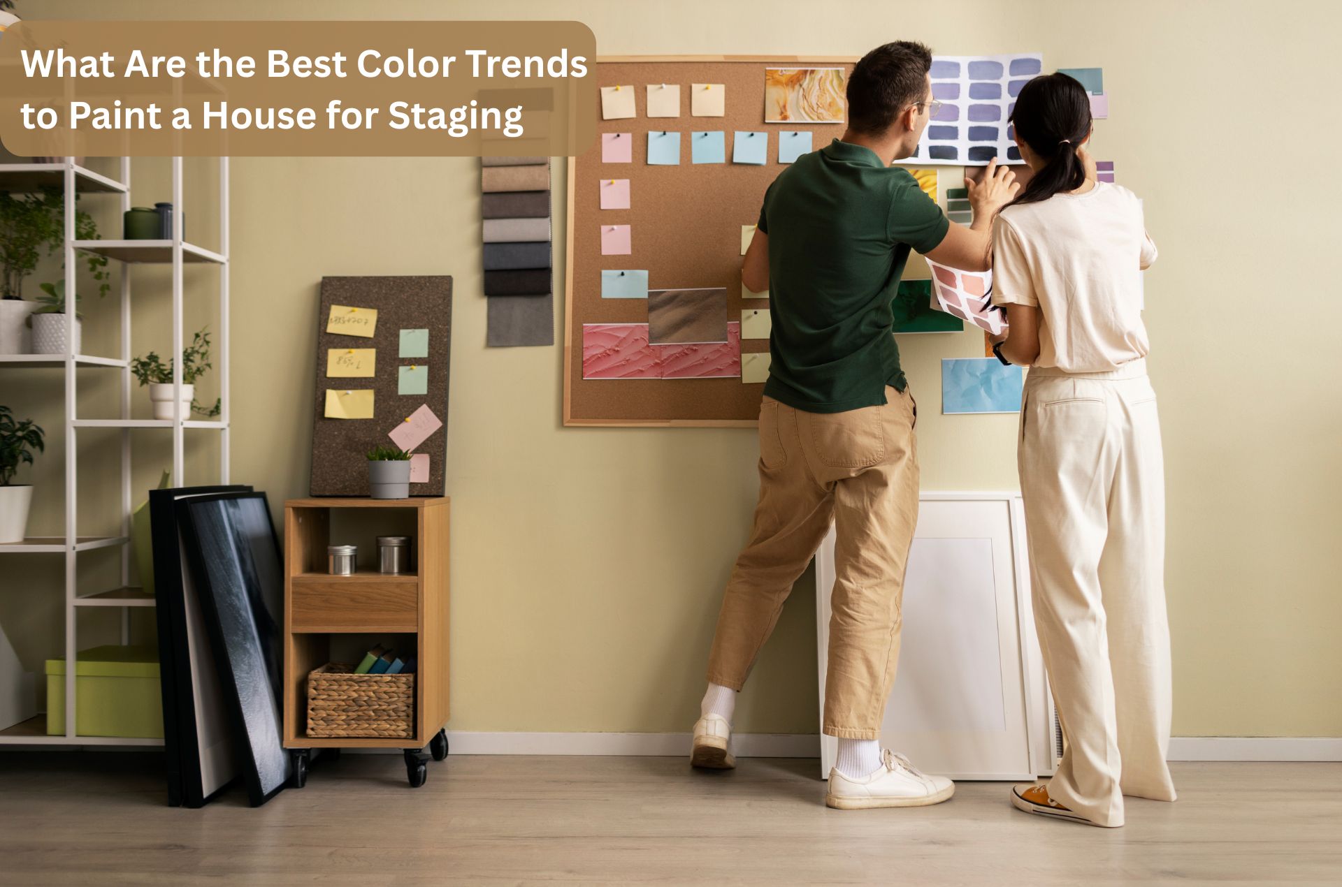
When a house is prepared for sale, paint colour plays a very important role. The right colour can make a home feel bigger, brighter, and more welcoming. The wrong colour can distract buyers or make rooms feel smaller. That is why choosing the best paint colours for staging your home is one of the first and most important steps in property styling.
Today, buyers prefer calm, clean, and neutral homes. Paint colours should help buyers imagine their own life in the space.
Below are the most popular and effective home staging paint colors that work well across different rooms and property types.
Why Paint Colour Matters in Home Staging
Paint colour sets the mood of a home. It is one of the first things buyers notice, even before furniture or décor. Neutral and balanced colours help buyers focus on the space, layout, and natural light.
In staging, paint is used to:
- Make rooms feel larger and brighter
- Create a clean and well-maintained look
- Help furniture and décor stand out
- Appeal to a wide range of buyers
This is why paint colour choices are never random in professional property styling.
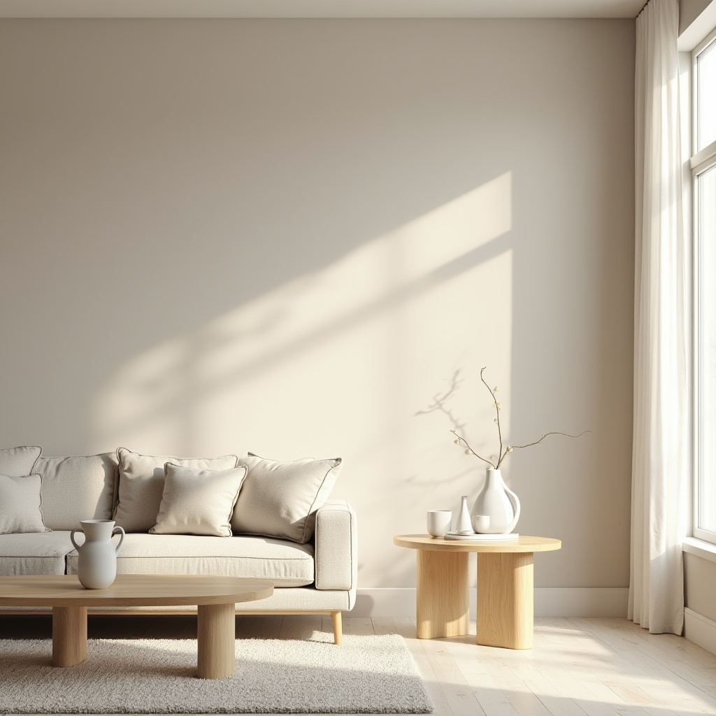
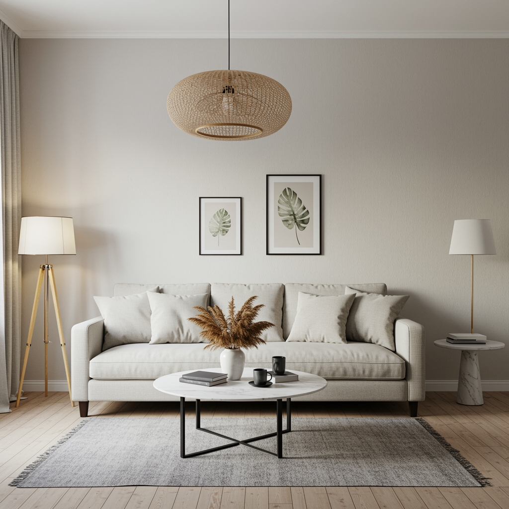
1. Warm White Shades
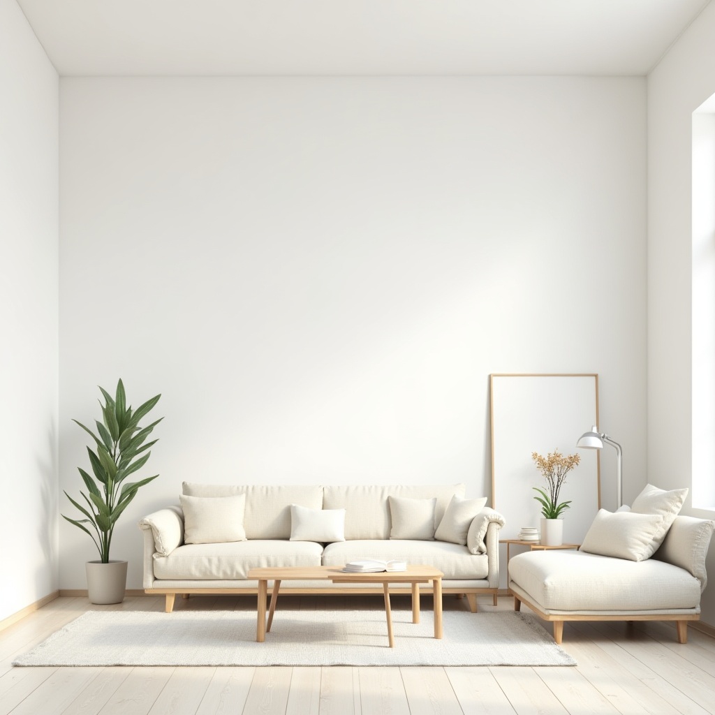
Warm white is one of the best paint colors for staging your home. It makes spaces feel fresh without feeling cold. Unlike bright white, warm white has soft undertones that feel more inviting.
Warm white works well in:
- Living rooms
- Hallways
- Kitchens
- Open-plan spaces
It reflects light beautifully and pairs well with styled furniture, rugs, cushions, and artwork. It also creates a clean background for timber furniture and soft décor items.
2. Soft Greige Tones
Greige is a mix of grey and beige. It is very popular in home staging paint colors because it feels modern and warm at the same time. Greige works well in homes where pure grey feels too cool and beige feels too dated.
Greige colours help:
- Add warmth to modern interiors
- Match easily with wooden furniture
- Create a calm and balanced look
These shades are often used in living areas and bedrooms to give a soft and elegant finish.
3. Light Grey for Modern Appeal
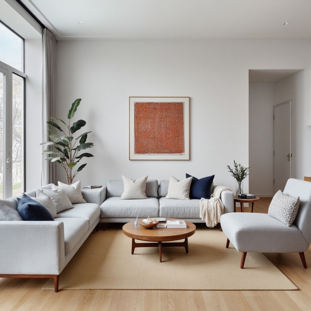
Light grey remains a strong choice in staging, especially for newer homes and apartments. It gives a modern and clean appearance without being too bold.
Light grey paint works best when:
- The home has good natural light
- Furniture is kept neutral and minimal
- Styling includes soft textures like cushions and throws
This colour helps furniture, wall art, and decorative accessories stand out while keeping the space simple.
4. Soft Neutral Beige
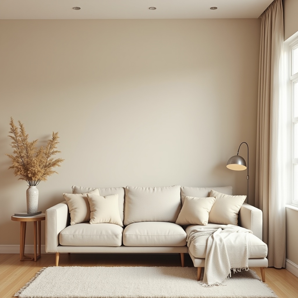
Beige has returned, but in a softer and more modern form. Today’s beige tones are lighter and more natural. They do not look yellow or heavy.
Soft beige paint colours:
- Create a warm and welcoming feel
- Work well in family homes
- Pair nicely with neutral sofas and rugs
These colours are often used in bedrooms and living areas to create comfort and calm.
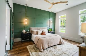
5. Subtle Pastel Tones
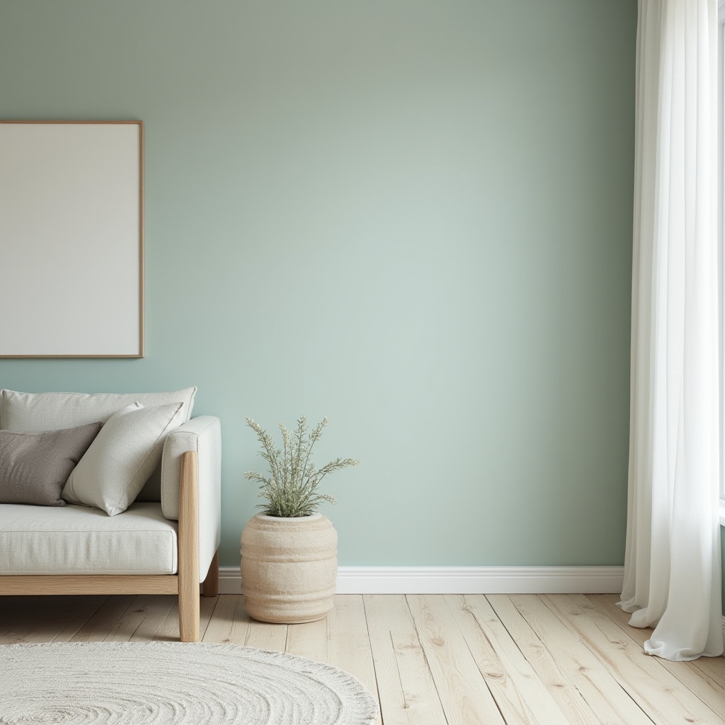
Very soft pastel shades are now used carefully in staging. Colours like pale sage, soft blue-grey, or muted blush are sometimes used as feature walls or in smaller rooms.
These colours are helpful when:
- A room needs personality, but not boldness
- The home targets younger buyers
- Styling remains neutral and balanced
Colour experts consistently recommend using muted pastels only in controlled and limited applications to preserve broad buyer appeal and avoid narrowing the market. This approach aligns with professional colour guidance shared by Dulux Colour Insights, which highlights the importance of soft, balanced tones when preparing homes for sale.
Pastels should always stay light and muted. Strong colours are avoided in staging because they limit buyer appeal.
6. Consistent Colour Flow Throughout the Home
One of the most important staging rules is consistency. Using similar paint tones across the home helps create flow. Buyers feel more comfortable walking through a home that feels connected.
Home staging paint colors are selected so that:
- Rooms transition smoothly into each other
- The home feels organised and well planned
- Buyers are not distracted by sudden colour changes
Consistency also makes property photos look more professional and appealing online.
7. How Paint Works with Staging Products
Paint colour alone is not enough. It must work with staging products like furniture, lighting, artwork, and décor. Neutral walls allow styled furniture to shine.
Common staging products that work best with neutral paint include:
- Fabric sofas in beige, grey, or off-white
- Wooden dining tables and coffee tables
- Neutral rugs with soft textures
- Simple artwork and indoor plants
The paint colour supports these products and helps the home feel styled but not personal.
If you’d like to understand how staging differs from interior design, read about the key differences between an interior designer and a home stager
8. Avoiding Colours That Do Not Work for Staging
Certain colours should be avoided when preparing a home for sale. Dark, bold, or very bright colours can turn buyers away.
Colours usually avoided in staging include:
- Bright red, orange, or yellow
- Dark purple or navy on large walls
- Very strong feature walls
These colours make it harder for buyers to imagine their own style in the home.
9. Simple Colours Create Strong First Impressions
Buyers often decide how they feel about a home within moments. Neutral and well-chosen paint colours help create a positive first impression. They make homes feel cared for, modern, and ready to move into.
Neutral-coloured homes attract broader buyer interest and help properties feel more market-ready during inspections.
Read Also: 5 Ways To Adapt To Living in a Staged Home
Conclusion
Choosing the best paint colours for staging your home is about creating comfort, space, and broad appeal. Warm whites, soft greys, greige, and light beige tones continue to lead home staging paint colors because they work across all property types. When paired with the right furniture, décor, lighting, and layout, these colours help buyers connect emotionally with a home.
Professional home stagers understand how paint colours interact with furniture placement, décor, and natural light. Instead of guessing, many sellers choose expert guidance to ensure every colour supports buyer appeal and overall presentation.
At Stage2Sell, paint colour selection is carefully planned as part of a complete home staging strategy. Colours are chosen to create flow, enhance space, and align perfectly with styled furniture and accessories so your home feels inviting, balanced, and market-ready. 👉 Request a FREE Callback Now
Frequently Asked Questions
Neutral colours help buyers focus on the space instead of the walls. They make rooms feel bigger, brighter, and cleaner. These colours also help buyers imagine their own furniture and lifestyle in the home.
The best paint colors for staging your home include warm white, soft grey, greige, and light beige. These colours suit most rooms and appeal to a wide range of buyers.
Yes, home staging paint colors work well for apartments, townhouses, and family homes. The shades can be adjusted slightly, but neutral tones remain effective across all property styles.
Rooms do not need to be exactly the same colour, but they should flow well together. Using similar tones helps the home feel balanced and professionally presented.
Yes, paint colour strongly affects first impressions. Well-chosen colours make homes feel modern, well cared for, and ready to move into, which helps attract more buyer interest during inspections.
Find Us on Google Map: